Ab Suomen Herrainpukimo Oy (lit.transl.: Finland’s Gentlemen’s Clothier) is a Finnish clothing company that offers premium clothing for men – including MTM suits and shirts as well as carefully selected shoes, accessories and RTW clothing.
The brand was launched in 2011 when the business concentrated mainly on made-to-measure-shirts and quality shoes. Since then the business has expanded to new heights and now everything necessary can be found under one roof.
The people behind Herrainpukimo are particularly proud of their suits and rightfully so: The company holds the title of one of Finland’s most sought after quality MTM suit suppliers. The suits themselves are made in Europe from only the best of materials and when combining the overall quality with countless customization opportunities, every suit ends up being unique and thus special.
Herrainpukimo has two stores in Finland: One in Helsinki (the capital) while the HQ is located in Turku.
The company is built on quality, serving individual needs, excellent customer service (trustworthiness) and sustainability. Tuukka Mård, The CEO of the company, highlights the importance of quality in every purchase decision. He gives an example about the things one can weigh when buying new shoes: Should I buy a pair of machine made fashion brand shoes that are made 1) in a developing country 2) with just average quality that lasts a year or two OR should I invest a bit more and buy a pair of quality shoes that can easily last over 10 years when cared for.

We began the Identity Design -project by diving into the history & culture of the company. During that process, we were able to pinpoint lots of valuable factors to be utilized as the foundations for the identity.
The Visuals
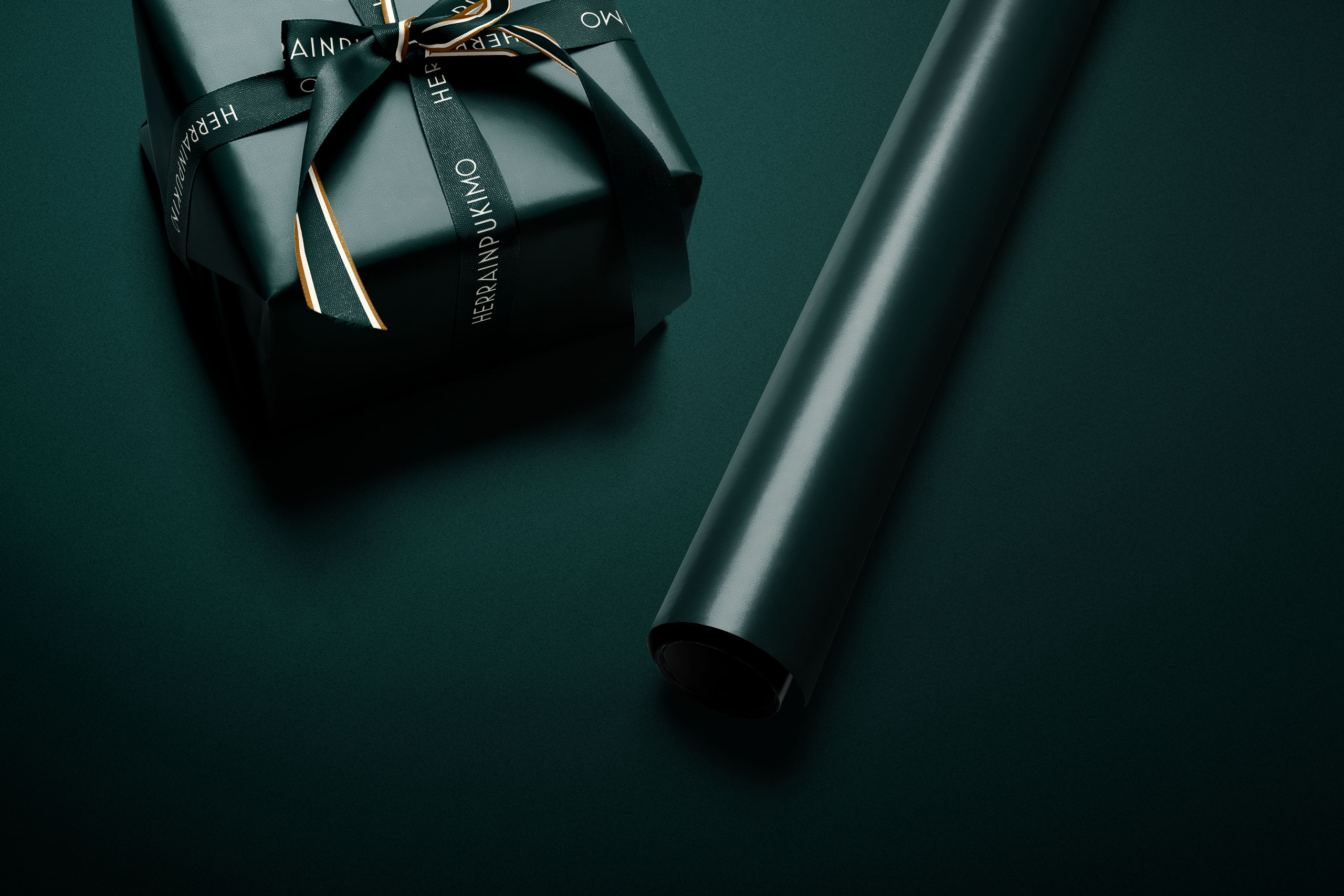
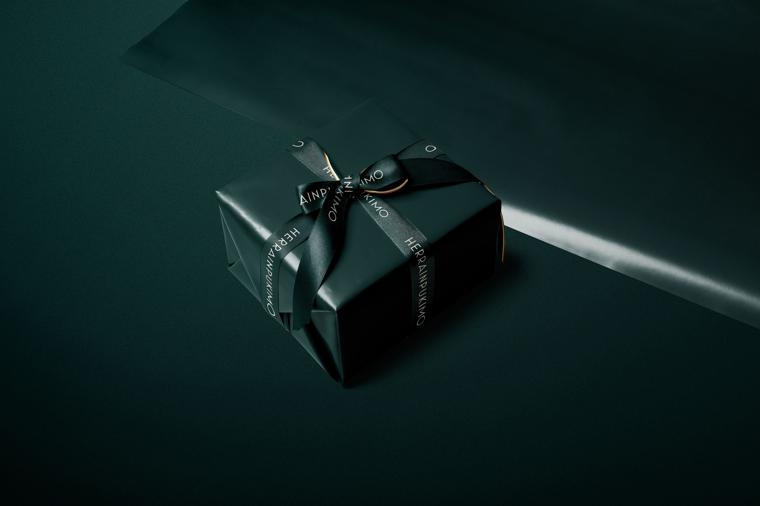
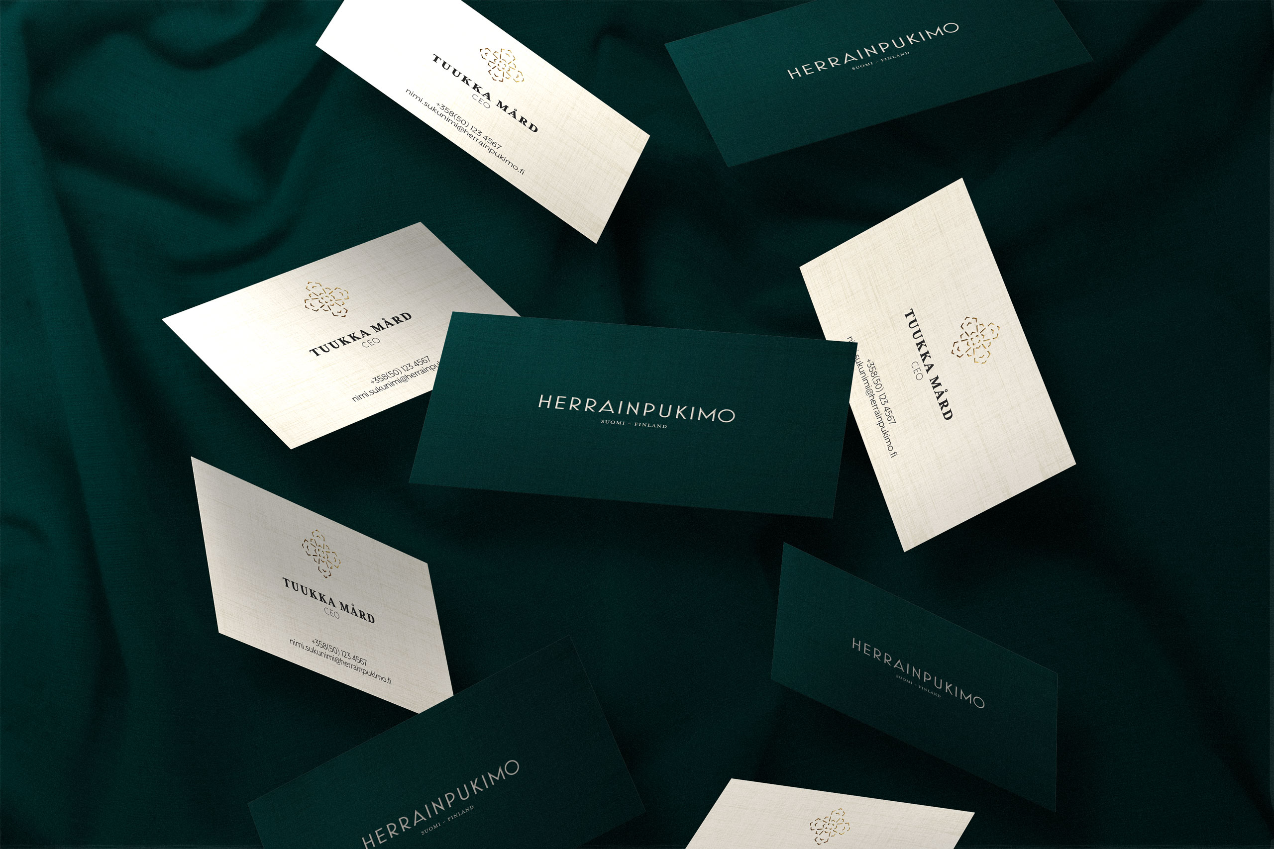
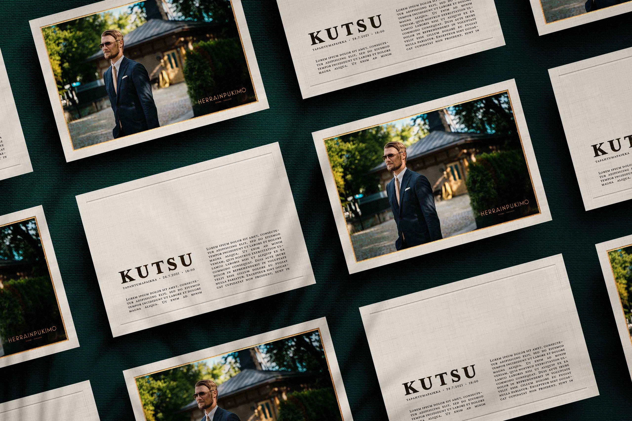
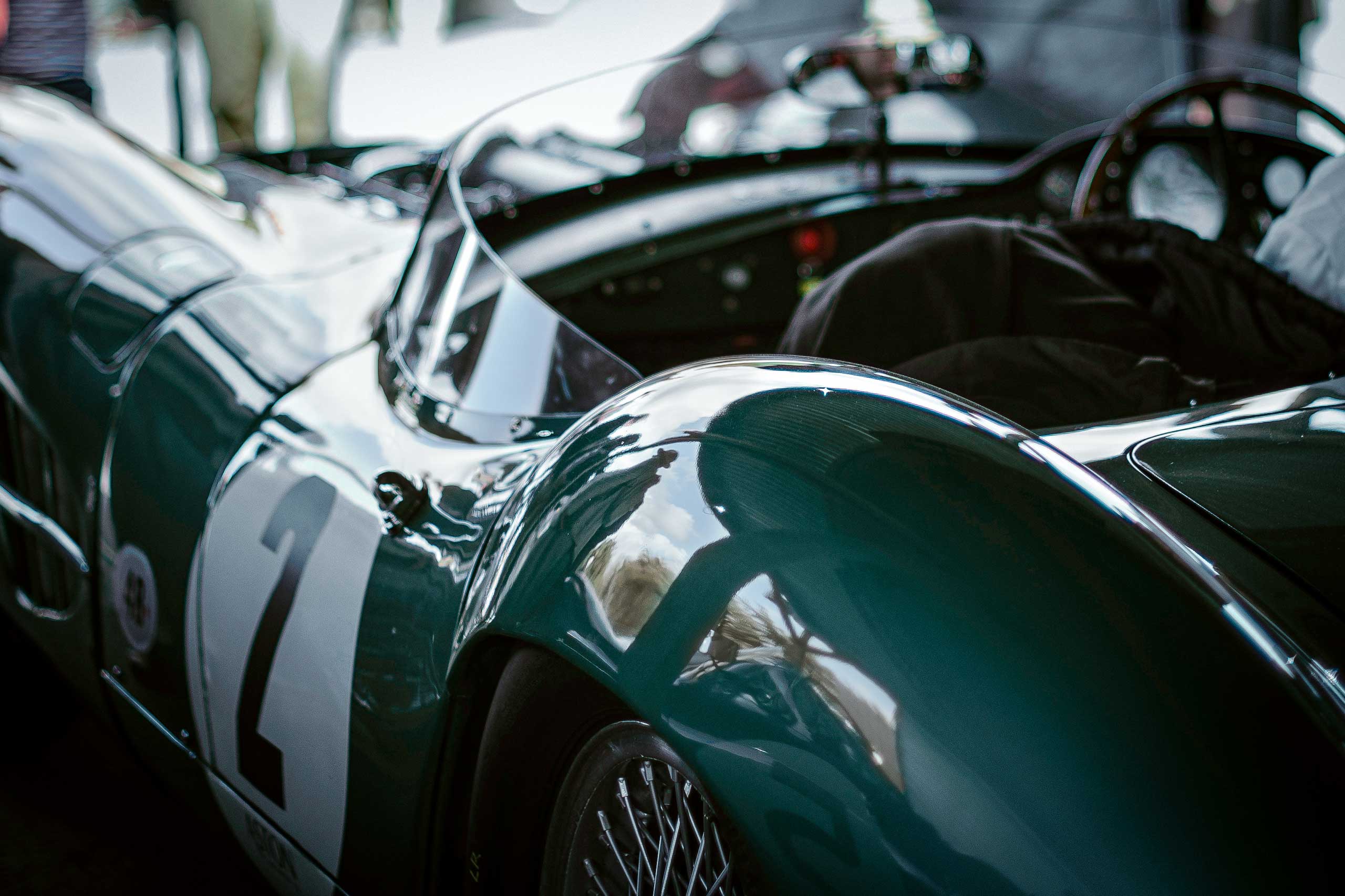
It was clear from the beginning that the company’s new visual identity should reflect the old visuals as much as possible while providing a new fresh touch. Classic colours ”British Racing Green” and ”Ivory” have served as the main colours of the company from the beginning but the exact hues have varied throughout the years. Now it was time to set clear guidelines and choose specific hues that represent the quality and the premium feel that the brand deserved.
With the main colour (Green), we ended up choosing a bit richer colour than before. We added traces of blue to it in order to reflect the look and feel of a modern metallic interpretation of British racing car under a clear blue sky. We then gave a small tweak to the secondary colour (Ivory) as well: The new fresh hue was chosen to complement the new HP Racing Green all while retaining the preciousness that the ”Ivory” colour embodies. In addition to the main colours, a couple of supporting colours were added to the palette in order to provide some elbowroom when designing the rest of the visual identity. The colours were specified in the most common colour spaces: Pantone, RGB and CMYK.
The old logotype used a nice sans-serif font but we thought it deserved a bit more persona. We found a perfect match that reflects the legendary Art Deco era (the 1920’s) when wearing a suit or a tux was a no brainer. The style of the new font is also a homage to the Italian design and tailoring – especially to the ”Neapolitan Shoulder”.
Even though the client wanted to get rid of the bowtie logomark, it was something that we wanted to retain in some form. We started to mock up different possibilities from ties to other accessories and to other abstract icons. Finally we came up with a stamp-like a seal of approval for Herrainpukimo: ”The Emblem of Quality”. We used the elements from the bowtie icon and re-created a symbol that tells about the quality of the products, all while – at the same time – acts as a nod to the heritage of the company. The emblem can also be used to make patterns.
No more outdated pdf-files and piled up versions. Most of our brand identity development projects include a web-based & up-to-date style guide hosted in our own Brand Book Library.
We are shifting towards using only web based Quotes and Project Plans.
Feel free to contact us if you have lost your login info.
Interested to hear our thoughts about your project? Please feel free to reach out. We will get back to you with our thoughts and a proposal for a quick chat. If we find ourselves to be a good match, let’s get the ball rolling and light up your brand!
Branditect Ltd is a limited company registered in Finland. The images and other types of content on this site are either 1) owned or licensed by Branditect 2) used with permission. Downloading or otherwise using the material is forbidden. The brands – including their logos and other materials – referenced on this site are protected by copyright and trademark laws and are owned by the respected parties.
Some of the links on our site are affiliate links and we may be awarded a comission from the sales made through those links.
© 2022 Branditect Ltd | Terms & Privacy Policy
We are proud to host our site with Zoner – one of the leading web service providers in Finland.